


Blog
Blog
Material Knowledge When Rendering
You can nail the modeling, set up great lighting, and find the perfect camera angle — but if the materials don't hold up, the whole render falls flat. A chrome faucet that reads as plastic. Concrete that looks like flat gray paint. Wood grain that feels off in a way you can't quite pinpoint. Getting materials right is where technical knowledge meets artistic eye, and it's one of the things that separates decent renders from convincing ones.
Material knowledge is essential in the rendering process for anyone working in 3D — whether you're in animation, architectural visualization, product design, or visual effects. Understanding how real-world materials interact with light, and how to recreate that behavior digitally, is the foundation of realistic rendering. This guide covers the core concepts you need to work with materials effectively.
Before adjusting sliders in your shader editor, it helps to understand what actually happens when light hits a surface. Every material in the real world does the same basic things with light — reflection, absorption, scattering — just in different proportions. That's what makes steel look different from skin, and glass different from rubber.
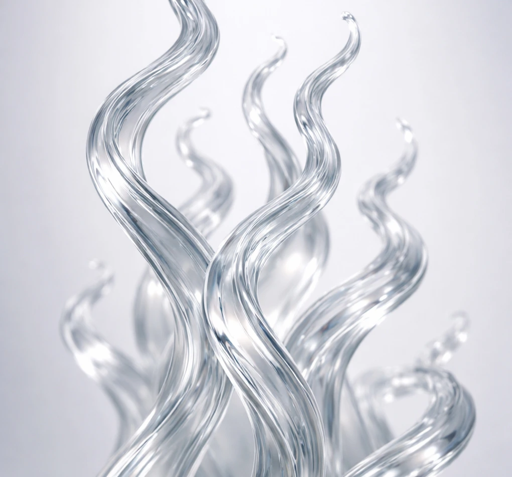
Materials can reflect light, like a mirror, or refract it, like glass. A polished mirror bounces almost all incoming light in a coherent direction. Brushed metal scatters it. A matte wall scatters it even further. Refraction happens when light passes through a material and changes direction — think of a straw looking bent in a glass of water. The amount and quality of reflection and refraction depend on the material's surface structure and composition, and understanding this relationship is key to setting up transparent and reflective materials in any render engine.
Materials absorb some wavelengths of light and scatter others, which is what gives them their color and translucency. A red brick absorbs most wavelengths except red. A leaf appears green because it absorbs other colors more than green. Translucent materials like skin, wax, or marble let some light pass through and scatter inside the surface — this is called subsurface scattering (SSS), and without it, organic materials like skin or leaves look flat and unconvincing in renders.
These properties define how shiny or dull a surface appears. A highly specular surface reflects light sharply — like a polished car hood with tight, clear reflections. A rough surface scatters light, softening highlights and reducing visible reflections — like a clay pot or concrete wall. In practice, roughness is one of the most important parameters you'll adjust when setting up materials. Small changes in roughness can shift a surface from looking synthetic to looking real.
PBR is the standard approach to materials in modern render engines — V-Ray, Arnold, Redshift, Blender's Cycles, Unreal Engine, and others all use it. Instead of faking the look of a material with arbitrary settings, PBR uses physically accurate shading models that describe how real surfaces behave under any lighting conditions. The practical benefit is significant: a PBR material that looks correct in one lighting setup will also look correct in another, so you don't have to re-tweak everything when the environment changes.
These are the key parameters in PBR workflows. Metalness indicates whether a surface is metallic, which affects its reflective properties — metals tint their reflections with their own color (gold, copper), while non-metals have neutral reflections. In most PBR setups, metalness is a simple 0-or-1 value, though transition zones exist for things like oxidized or painted metal. Roughness measures the microsurface irregularities that scatter reflected light — a value of 0 gives you a perfect mirror, while 1 gives you a completely matte surface. Most real-world materials fall somewhere between, and varying roughness across a surface is what makes materials feel lived-in.
Albedo is the color of a material under neutral lighting — no shadows, no highlights, just the raw color. It's typically used as the base color in PBR workflows. An important detail that's easy to overlook: albedo values should stay within a physically plausible range. Pure black and pure white don't exist in the real world, so your albedo textures shouldn't contain them either. A common mistake is baking lighting information into the albedo map, which makes the material look wrong under different lighting conditions.
Textures are crucial for adding realism to materials. A flat material with uniform values looks synthetic. Texture maps let you represent color variations, bumps, scratches, wear patterns, and other real-world imperfections that make surfaces feel tangible. A well-set-up material usually relies on several maps working together:
Represent the base color or albedo of a material. In a PBR workflow, this should be a clean color map without baked-in shadows or ambient occlusion — think of it as what the surface would look like under perfectly flat, even lighting.
Simulate small surface bumps and dents without changing the actual geometry of the 3D object. Brick grout lines, fabric weave, metal scratches — these can all be represented with normal maps. It's one of the most powerful tools for adding detail without increasing polygon count, and it renders much faster than actual geometry.
Dictate the specularity across the surface, allowing for varied reflectiveness. In a metalness workflow, the metalness map serves a similar purpose — telling the renderer which parts of the surface are metal and which aren't.
Unlike normal maps, displacement maps alter the actual geometry of surfaces, creating real depth that's visible in silhouettes and at grazing angles. This provides significantly more detail during the rendering process, but at a higher computational cost. For close-up shots of stone walls, bark, or fabric, the difference is often worth it.
Control how roughness varies across the surface. A single roughness value makes a material look artificial. A roughness map with variation — slightly shinier where people touch a surface, duller in crevices where dust collects — is one of the most effective ways to make a material feel real.
The toolset for creating realistic materials has become impressively powerful over the past several years. Here are the main options working professionals use:
The industry standard for PBR material creation. Substance Painter lets you paint textures directly onto 3D models with real-time feedback. Substance Designer is node-based and built for creating procedural, tileable materials from scratch. If you do material work professionally, you'll likely use one or both of these tools.
A massive library of photogrammetry-scanned real-world materials and assets. Originally a standalone suite, Quixel is now part of the Epic/Unreal ecosystem and available through the Fab marketplace. If you need photorealistic surfaces quickly — ground, walls, stone, wood — this is an excellent starting point that saves hours of manual texture work.
All major 3D modeling tools feature robust material editors to fine-tune the appearance of surfaces. These range from simple slot-based interfaces to full node graphs. For production work, the typical workflow is to create base textures in Substance, then do the final material setup inside your 3D application or render engine.
Tools and theory are the foundation, but here's what tends to make the biggest practical difference:
The best material artists are obsessive observers. Pick up a coffee mug and really look at it — the slight sheen on the glaze, the matte ring on the bottom where it's unglazed, the micro-scratches where it slides across the counter. Reference photos are helpful, but there's no substitute for studying actual surfaces under different lighting conditions. Train your eye to notice what makes one surface look different from another.
Many real-world surfaces consist of several layers. Car paint has a base coat, metallic flakes, and a clear coat on top. An old wooden floor has varnish, wear, dirt, and wax buildup. Simulating these layers — even subtly — can greatly enhance realism and is what separates a believable material from a flat, unconvincing one.
Real-world surfaces are rarely perfect or uniform. Fingerprints, dust, edge wear, scratches, water stains — these imperfections make a rendered material feel tangible. If your material looks too clean, it looks fake. Adding subtle wear and variation is probably the single most impactful thing you can do to improve the realism of your renders.
A flat roughness value across an entire surface is a dead giveaway that something is CG. Break it up. Edges tend to be shinier from wear. Recessed areas collect dust and grime, increasing roughness. Even brand-new surfaces have subtle variation. A good roughness map does more for realism than almost any other single texture.
Even experienced artists fall into these traps. Knowing what to watch out for can save you hours of troubleshooting:
Material knowledge is fundamental in 3D rendering, bridging the gap between digital art and real-world physical appearances. The core principles — how light interacts with surfaces, how PBR models represent that interaction, and how texture maps control the fine details — stay consistent across every render engine and application. Once you understand these fundamentals, switching between tools becomes much easier, and your materials will improve across the board.
When you're ready to see your materials at full quality — with proper lighting, high sample counts, and no compromises on render settings — a cloud render farm gives you the processing power to do it without tying up your workstation. TurboRender supports all major 3D software and render engines, and you can try it with free render hours to see how your materials look when hardware isn't the limiting factor.
Subscribe to receive news about discounts and plugin updates
